Tuesday, 19 March 2013

Animation Test- Old Man

I made an animation test of the old man character. Here it is...


I've tried to produce three different walks for the old man. The idea is that, as he gets further from the city and closer to the hills, the old man will become more agile and find a bit of a new lease in life. So the mechanics of the three walks are actually different from each other.

  • In the first, excruciatingly slow, walk the man essentially has three legs. He takes a step with the right, a step with the left and then a step with the cane. He needs the cane for support during both of his steps making for slow going! (I think it may actually prove to be too slow when applied in the actual animation).   
  • In the second he has become able to link together a continuous walk cycle (not the stop start technique he used to use). He only needs his cane to support the step with his left leg (that's the knee that has always given him jip since he came off his trials bike in the woods when he was a teenager... oh no wait that's me!.. maybe it's autobiographical).
  • By the third walk he's really feeling good! He doesn't even need the cane anymore but is enjoying swinging it about anyway. He's actually only planting the cane every second cycle of steps now. The fact that we are going to see the old man get to this state, in which he doesn't actually need the cane, hopefully means that we'll find it easier to understand when he eventually forgets it and walks off without it after finding the antler. 


I also made this mock up of the scene in which the three walks would be shown, while he is making his way through the arable farmland between the town and the hills. The three 'panels' would play simultaneously although appear one by one from top to bottom. They're also all supposed to have crops in them like the middle panel (although different styles of crops to highlight his progression) and the test is not indicative of the final colour.

It's a pity the quality of video goes down the drain as soon as you upload to blogger. You can't even make out that the action takes place within three seperate framed 'panels' in the second video... you'll just have to imagine it!
I've also tried to make the quality of line seem hand drawn even though it was made digitally and the lines of the character are actually vector based. But there's no hope of scrutinising that in these vids! Oh well.
Another also- spot the wacky first step taken in the first walk! Not intentional.

Update- Hart's Desire Comic etc

I have not posted in a while so I thought I better do some updating! (I've been writing my essay and being really productive in other ways... honest).
So what have I been doing?

I finished a colour version of my Hart's Desire comic and made a prototype. Which was exciting. There's still a pesky page showing a close up of the antler that I think I want to redraft.


I finally made an animatic which was the first step away from being consumed by this comic and actually getting on with the animation. I actually found that, having produced the comic, I was able to fairly directly translate its narrative and imagery into a coherent and readable animatic. I wasn't sure how much I would be able to do that but I'm pleased that I found I could because part of the comic's raison d'ĂȘtre was to inform the composition of the animation: to liberate the way in which I was going to tell this story out with the confines of a 16:9 aspect ratio. This is not to say that I have simply 'cut and pasted' the comic book panels into a timed movie file (well... with some panels I basically did). I found that I had to add bits and cut bits that had been present in the comic for the pacing and narrative of the animatic to satisfy and, more importantly, be understood. One of the problems with an animated film that does not exist in the reading of a comic is that you're locked on a "treadmill of the now" as Scott McCloud, author of 'Understanding Comics', describes it (in an interview you can watch by clicking here). As the audience has no control over the pacing, it's up to me to decide how much information I need to give them and, on a really basic level, simply how long they need to be looking at something to understand what I'm trying to tell them. It's something that I worry about because I find it difficult to detach myself from the role of creator in order to forget that I know what's going on and check that what is being played out in front of me does indeed make sense. It's far less of a worry when making a comic because, as McCloud says, when you read a comic you can “rise above that landscape of time and you're looking at past present and future all around you in these different moments spread out on the paper”. Anyway, Will thought that the animatic was good and he's a BAFTA winner so it must be OK! (haha). 

I've submitted Hart's Desire to the Edinburgh International Film Festival, my first ever film fest submission! So fingers crossed.

Oh!... I drew a pheasant.


Monday, 11 February 2013

Emotional and Expressive Development

Today I had a bit of a chat with Alan. We were focussing on the issue of the more expressive and human moments in my film and thinking about how the two characters will be brought to life through their movement and expression, something that will hopefully help to give the film the emotional depth that is, perhaps, lacking to date.

We reviewed the comic prototype and talked about the further possibilities and potential strengths of a few particular moments, agreeing that the bones of the story are all in place in the comic (all the necessary pieces are there).

When the old man and the deer-man meet, for example, is a very important moment. Animating the sequence brings the opportunity to really examine and develop the relationship between the two characters and how they behave during this encounter. The sequence should also further set up or confirm the idea that these two are eventually going to effectively swap lives. The two will meet with some trepidation and eventually come to learn from each other, something of the lives they seek.

The mug that the deer-man hangs from his antler can become a very strong symbol in the film: an object that symbolises human sociability for the deer-man yet one that he is unsure of how to use. When they meet, the old man can teach him what the function of the mug is, thus strengthening the deer-man's confidence in his ability to interact with the people of the town.

In an earlier sequence the fact that the deer-man doesn't quite understand how to use the mug can be addressed thus narratively pre-empting the lesson from the old man. This could occur when the deer-man tries to 'share' his object with the squirrel.


This portion of the narrative could be tweaked so that the deer-man is on his own, sort of playing with the mug, unsure of what to do with it. A squirrel arrives and the deer-man offers the mug to the squirrel (perhaps upside down) to see if he can work it out. The squirrel of course quickly looses interest as he does here and scampers away, leaving the deer-man alone once more. This could be quite an amusing exchange and would hopefully conjure a few smiles... squirrels are inherently pretty light-hearted.

A similarly light-hearted moment that could bring a few smiles is another that includes a typically comedic animal: sheep. 


When the old man tries to battle his way through a 'field' of sheep there is the opportunity to further develop his emotional journey in line with his physical one. This struggle through an overcrowded area can be the second time that the man has faced such a crowd, the first having been when he leaves the busy streets of the town. The emotional cleansing of the old man will be curtailed by the field of sheep: he was starting to feel that he was free as he walks through the arable fields and a spring in his step has perhaps developed... he sees a sheep who he smiles at but soon he is surrounded by them and he becomes frustrated that he can hardly move... he has had enough when one sheep, deciding that it looks tasty, grabs the old man's walking stick... his progress is brought to a jolting stop and he shouts in frustration... the sheep scatter... he is now truly free of overcrowding and about to find the antler, starting the next chapter in his bid for happiness. Unlike in the struggle to get out of town, I think that this moment can be quite funny. 


Wednesday, 30 January 2013

360°

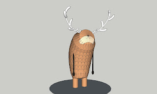
I have spent the last couple of days creating a full 360° animated rotation of my Deer-Man character.


I did this because I want there to be a bit more freedom of movement in my animation than a basic 2D anime studio rig will allow. I am aware however, having chosen to create an animation largely about antlers, that I have some fairly complex shapes to rotate frame by frame in a third dimension.

To serve as a guide for this rotation I created a basic 3D model in SketchUp, just something to identify mass, based on an existing image of the 2D anime studio rig that I had previously made for a walk test of the character.


Once the 3D model was built, I made a quicktime of it rotating and essentially just rotoscoped that footage using a style that may be something more like the finished article that I'm looking for.


Although I probably won't be using this 3D model, rotoscoping technique for the final animation, this exercise can be used as reference when I do come to animate something like a head turn for example.    


Monday, 10 December 2012

Hart's Desire Comic

At this stage, rather than developing a storyboard and animatics I have been creating a comic of my deer-man story.
Having cited independent comic book artists as inspiration, and while writing an essay on the relationship between animation and comics, I decided that it might be interesting to initially develop the narrative in comics form. My hope was that this process would help me to develop a more considered approach to the composition and 'scene-craft' of the story that may have been lacking if I had dived into creating an animatic for motion.

Here are a couple of pages from the comic, which I have titled Hart's Desire (get it? A Hart is a name given to stags... aha ha ha, how terribly clever). I intend on building up the artwork a bit with shading and perhaps subtle colour. Click on them to enlarge.


One thing that I have noticed is that I have found it difficult to completely let go of the animator in me: in a great deal of the comic there are only small changes from panel to panel, meaning that I am trying to control the motion and show the reader/audience exactly how things are moving. When I look at other comic books there seems to be the potential for far greater changes in image from one panel to the next (especially in action packed superhero comics) while still creating the sense of a coherent and flowing story. 
Having said that, because this is a 'silent' comic (as there is no dialogue) the story relies even more heavily on the imagery and I think that there is a greater need to ensure that the audience are able to understand what is happening through the sequencing of action. Also, because there is no time prescribed in the reading of comics unlike in animation (when the audience does not dictate the pace of the action), the artist must try to take some control over how somebody interprets the pacing. One way that this can be done is by only changing things subtly between panels to suggest a slower, more delicate flow. The comics of Jon McNaught, one of my favourite comics artists, are often 'silent', 'delicate' and well considered by using this technique of subtle changes. Here's an example of his work.

What strikes me about McNaught's work is that it shows a very considered and effective, highly designed approach. I think that this is what attracts me to it most: a remnant of my architectural education perhaps, as I can't help but think of McNaught as a comics designer rather than a comics artist. I think that my Hart's Desire comic shows some level of this attention to design... because of this I think that it has been a worthwhile sub-project as I'm not sure this would have developed in an animatic. I hope that I can now take pieces of what works well in the comic and filter them into my approach to the animated film.   

Friday, 16 November 2012

Character Design- Old Man

I've just been perusing some earlier concept stuff I did and stopped to think when I looked at this drawing.

More recently I have been drawing my old man in a very simple way: just a bald circle for his head. He looks quite babyish sometimes. I like this older drawing and I think it's mostly because he has a beard! Nothing says old man like a beard.

Since I'm talking about beards... click here for a brilliant celebration of the beard in animated musical form!

Thursday, 1 November 2012

Yipee... Animation!!!

Couldn't resist a wee bit of animating.

Here's a little test I did of the deer-man. It's just a simple anime studio rig, drawn in photoshop. 


The quality is awful... so here's a still at full res so you can see the detail that you're supposed to see. (click it for full size view)...